Collaborations Across My Music Collection
A personal jazz library turned into a collaboration network — every musician a node, every shared album an edge. 435 musicians, 3,394 connections.
Desktop only. This project is built around a force-directed graph and WebGL rendering — it’s not suited for mobile.
Overview
This started as a simple question: who are the most connected musicians in my jazz collection, and what does that say about how I listen?
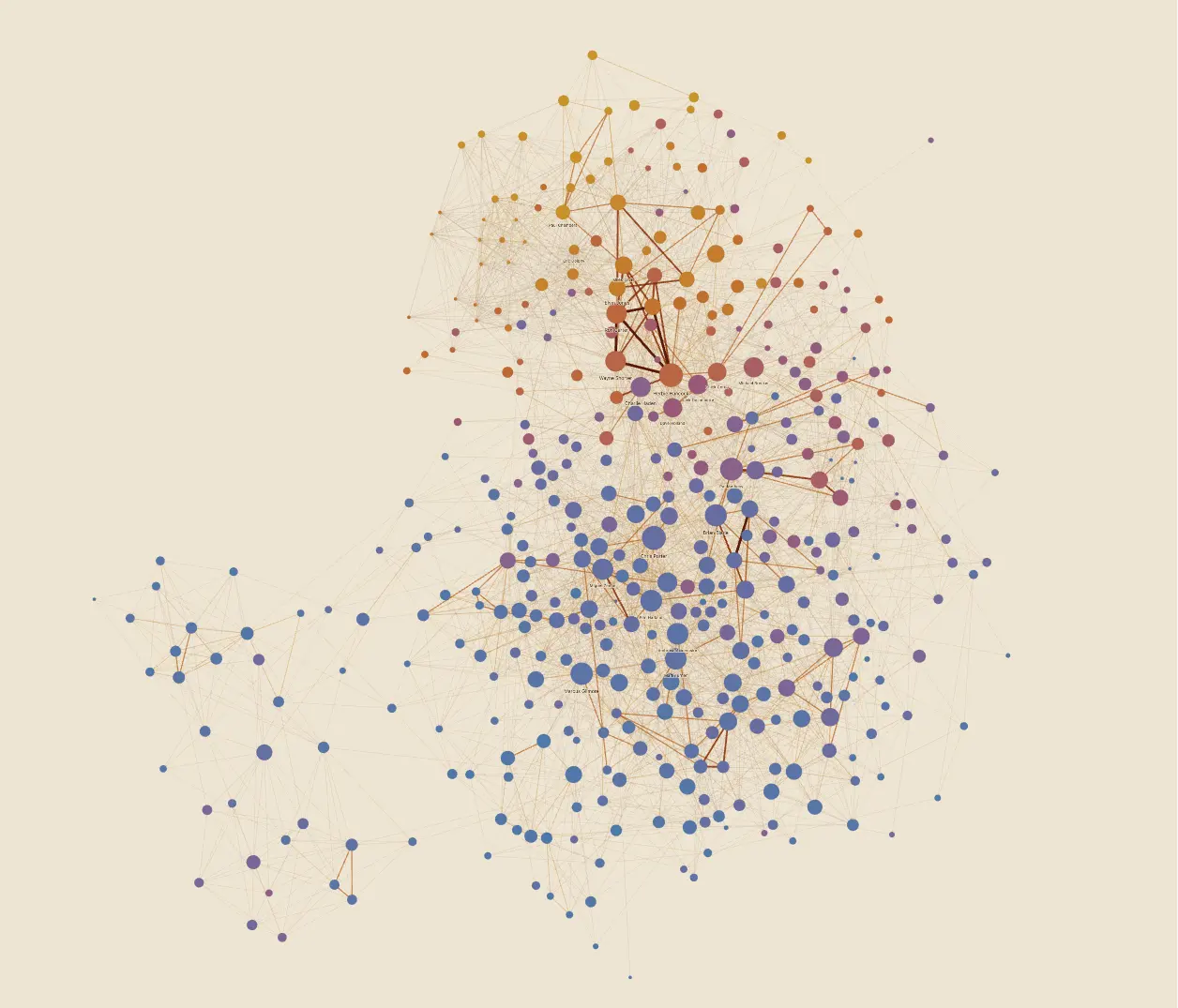
The answer is a force-directed collaboration network built from a MusicBee library export. Every musician in the collection becomes a node. Every album they share with another musician creates an edge between them. Node size reflects how many unique small-ensemble collaborations a musician shows up in — a big band appearance counts less than a quartet session. Community detection groups musicians into clusters by recording context: hard bop Blue Note regulars, Belgian contemporary jazz, free improvisation, post-bop, and so on.
The result: 435 musician nodes and 3,394 edges, drawn from 892 albums with full Discogs credit metadata. At the top: Wayne Shorter (65 connections), Ron Carter (63), Herbie Hancock (62).
How It Was Made
The data pipeline starts from a raw MusicBee export (library.json, one row per track). A one-off script hit the Discogs API to match every album to its full musician credits via the extraartists field. This ran once and took hours — Discogs rate limits are brutal. The result is committed to the repo and not re-run lightly.
From there, build-graph.js is where the interesting decisions live:
- filters out non-performers by role (engineers, producers, mastering, A&R, liner notes, arrangers)
- deduplicates credits per album by Discogs artist ID (same person listed as “Guitar” and “Producer” counts once)
- applies harmonic edge weighting: full credit for the first two shared albums between a pair, then 1/3, 1/4, etc. — so a fixed ensemble recording 10 albums together doesn’t dominate the graph over a more cross-context collaborator
- runs Louvain community detection to get 14 distinct communities, each color-coded
The harmonic weighting came out of a real problem: ensembles like the Brussels Jazz Orchestra form tight cliques because all members appear on every record together. Harmonic weighting compresses that without eliminating it — a different kind of collaboration, not a lesser one.
Wynton Marsalis was the canary in the coal mine for data quality. An early version had him as the biggest node — clearly wrong. Tracing it back: he was appearing multiple times per album credit list, and non-musician roles weren’t filtered. After deduplication and role filtering, he correctly sits at degree 6, connected to his own group.
The visualization has three modes:
Graph — Force-directed layout rendered with PixiJS (WebGL) rather than SVG. At 435 nodes and 3,394 edges, SVG was too slow. Edges are bucketed into 6 weight tiers. On hover, non-neighbour edges drop to near-invisible; neighbourhood edges highlight gold.
Arc Timeline — Musicians laid out chronologically from 1954 to 2022 on an arc. D3 SVG. Shows how the collection is distributed across eras.
Narrative — Scrollytelling mode that walks through the collection as a personal story. Who I listened to first. How my mother’s Keith Jarrett records eventually got through to me. Dexter Gordon on YouTube at 17. Elvin Jones obsession. Following threads from Brussels’s jazz scene outward from one conversation at De Werf in Bruges.
Context
Started in March 2023 as dataviz prototype for the Connections Lab class at NYU’s IMA Low Res program. At that point, I got as far as getting a working network graph and some data wrangling — then shelved. Rebuilt from scratch in March 2026 with a new stack (Svelte 5), a proper data pipeline, all new ways to view and navigate the data. About a week of focused work.
The Narrative mode exists because the graph alone doesn’t explain why any of this matters. The collection has a specific shape, Miles Davis as gravitational center early on, Elvin Jones forming a second pole, the Belgian contemporary scene forming its own cluster much later — and that shape has a personal history attached to it. The scrollytelling is an attempt to make the data tell that story rather than just display it, but very much an attempt.